In 1923, two University of Wisconsin-Stout students won a school song contest by writing “Alma Mater.” The third line of the lyrics, “With tower high and brilliant ‘S,’” highlighted imagery instantly familiar to those attending the university.
The song has endured, as have the Clock Tower and the proud “S” that hangs from it.
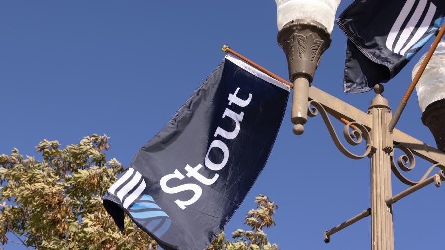
One hundred years later, a brilliant new “S” has been chosen as the university’s new logo. With three parallel bands and three tiers rising flame-like, it represents a university with a proud past and a bright future.
“The new mark traces the path of innovation through our past and present and illuminates our future. It honors our three educational tenets: applied learning, career focus, and collaboration,” Chancellor Katherine Frank said.

The logo will be phased in universitywide in 2023. The effort coincides with goals and initiatives related to UW-Stout’s FOCUS2030 strategic plan. One of five goals within the plan includes advancing the university’s polytechnic reputation.
UW-Stout has had numerous symbols over the years, many featuring a version of the “S.” A logo introduced in the early 1990s during the university’s centennial was a quill inspired by the quill weathervane that stands atop the Clock Tower.
The new “S” represents students, faculty and staff who are constantly innovating and growing and a university that is boldly striving to serve Wisconsin and society, in part through a strong bond to business and industry.
“It reinforces our aspiration to provide students with a degree grounded in applied learning and research, the professional experience to apply it wisely, and the tools to continue to engage collaboratively as lifelong learners,” Frank said.
Strategic Marketing Officer Michael Huggins sees the logo as a symbol of the next era for a university that has always evolved with the times. Some majors, such as early childhood education and mechanical engineering, can be traced to the university’s founding as Stout Manual Training School. Others, such as animation and digital media, represent a world and higher education that have changed significantly during the past 130 years.

"Stout has always been an engine of innovation focused on preparing its graduates to empower their careers and power business and industry in Wisconsin and beyond. We're excited to launch a refreshed logo that both honors the lineage of our alumni and reflects our commitment to career-focused education,” Huggins said.
A.J. Liedl, brand manager in Marketing Communications who led the effort, said "the visual presence of a recognizable ‘S’ mark in our new logo helps us re-ignite the passion for everything UW-Stout and what our institution has to offer. The three bands tell the story of our brand and what it stands for. We're excited to inject new energy into our brand with a logo that has flexibility and boldness and that will make us stand out into the future."
Choosing the logo
The logo was designed by Simpson Scarborough, a Virginia-based firm that has helped brand numerous universities, such as Butler, Creighton, Fordham and Northwestern, as well as other polytechnic universities, such as Cal-Poly.
The new “S” was chosen from several concepts presented by Simpson Scarborough, which conducted field tests and surveys.
Among alumni who responded to a survey about two logo concepts, 75% preferred the three-tiered “S.” Presentations also were made to alumni groups.
“As an alumni board of varying ages and professions, we love how this new logo embraces the history and future of UW-Stout. It is refreshing and also pays homage to our roots," said Nikki Stephany, a 2004 graduate and Alumni Board president.
While the national firm was selected for the logo's development, UW-Stout also engaged alumni to help develop the new brand. Studio MLM, a local brand and identity studio owned by Chief Creative Officer Micah Maraia ('03) and almost entirely staffed by Stout alumni, including Creative Director Tyler Michaletz ('16), animated the new mark.
The university’s Identity Standards Committee and designated faculty from the School of Art and Design were consulted throughout the development process.
Faculty, staff and students, including shared governance groups, were invited to provide input on logo concepts, and they were part of Simpson Scarborough focus groups.
###


